Optimizing an Enrollment to Boost Sign-Ups and Reduce Drop-Offs
StandUp Wireless is a telecommunications company founded in 2010 and headquartered in Clearwater, Florida. The company offers affordable mobile phone services, including prepaid plans, with a focus on providing accessible wireless solutions to underserved communities. As of late 2024, StandUp Wireless serves over 1 million customers and partners with various government assistance programs to ensure its services are available to millions of Americans.
As Lead UX/UI Designer, I was brought in to revamp the existing enrollment flow—which performed well but had room for improvement. The original design felt outdated, with poor accessibility due to low contrast colors and small font sizes.
I started by auditing the current flow to identify friction points. Then, I redesigned the experience with a modern look, clearer steps, and improved accessibility to reduce drop-offs and boost sign-ups. After multiple iterations and stakeholder reviews, I handed off the final designs to developers with detailed specs for a smooth implementation.
Overview
Industry
Telecommunications
Client
Standup Wireless
Platform
Desktop
Role
UX/UI Designer
Users were abandoning the sign-up process due to friction points and unclear steps
Existing flow lacked clarity, guidance, and mobile optimization
Needed to streamline the process without sacrificing required compliance or data collection
The Challenge
Users were abandoning the sign-up process due to friction points and unclear steps
Existing flow lacked clarity, guidance, and mobile optimization
Needed to streamline the process without sacrificing required compliance or data collection
The Solution
To guide the redesign, I conducted a full UX audit of the existing enrollment flow and reviewed analytics to pinpoint where users were dropping off. I also performed a competitive analysis of other telecom and government benefit program enrollment flows, including ACP and Lifeline providers, to understand industry standards and user expectations.
From this research, I identified key pain points such as unclear CTAs, a mobile experience that lacked responsiveness, poor accessibility, and redundant steps that slowed down the process. These insights laid the foundation for a more streamlined, user-friendly redesign. I also performed research on competitors to understand the standards for successful enrollment flows.
Research & Analysis


Competitors:


I started by redesigning the user flow—streamlining and reorganizing screens to reduce friction and make the enrollment process more intuitive.
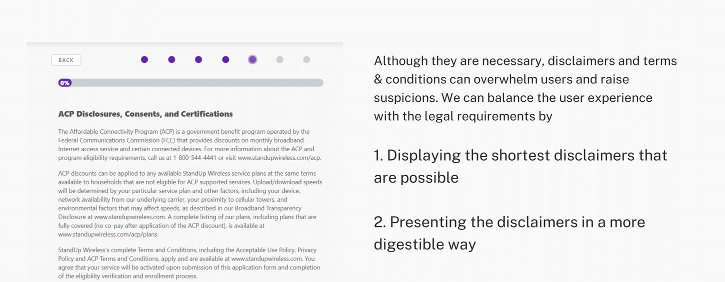
From there, I created wireframes that broke the experience into clear, step-by-step screens, guiding users through each stage of enrollment with ease. I then compiled my findings into a powerpoint to present to my stakeholders, highlighting the areas of the flow and interface that could be improved.
You can view some of these slides below, the full presentation is not included due to restraints.
The Process
After my vision was approved, it was time to begin working on the designs, the visual design focused on a clean, modern UI that stayed true to the brand while meeting accessibility standards. I paid special attention to mobile optimization by increasing readability, adjusting button sizes, and ensuring responsive layouts across devices.
Throughout the process, I collaborated closely with the product and compliance teams, incorporating their feedback to refine both the UX and UI at each stage.


Mobile Prototype
Desktop Prototype
Next Steps
After having the designs approved and finalized by marketing and legal teams, I created a presentation that dove into the details of each design and how each change would assist us in increasing enrollments from the flow while decreasing the amount of abandoned sessions.
Small UX improvements—like clearer CTAs and streamlined steps—can have a big impact on conversion rates.
Prioritizing accessibility and mobile responsiveness early on leads to a smoother user experience across all devices.
Key Learnings
The redesigned enrollment flow was developed and successfully launched. Post-launch results showed a 27% increase in enrollments and a 10% decrease in abandonments—demonstrating the effectiveness of the streamlined, accessible, and mobile-friendly experience.


